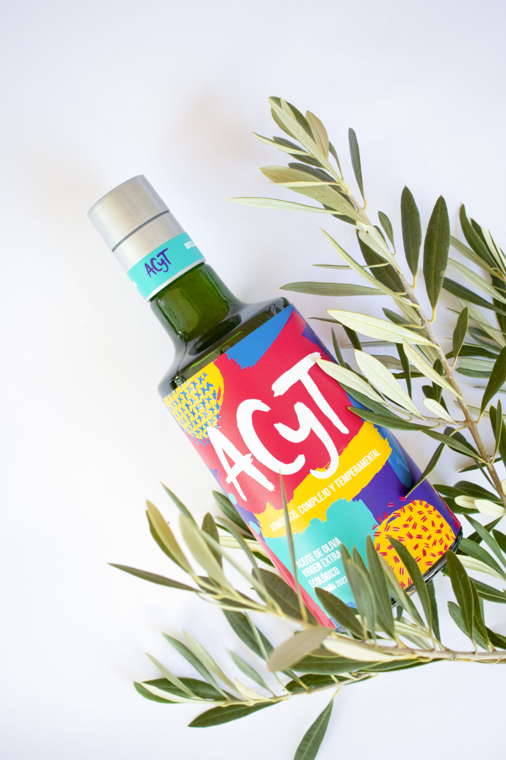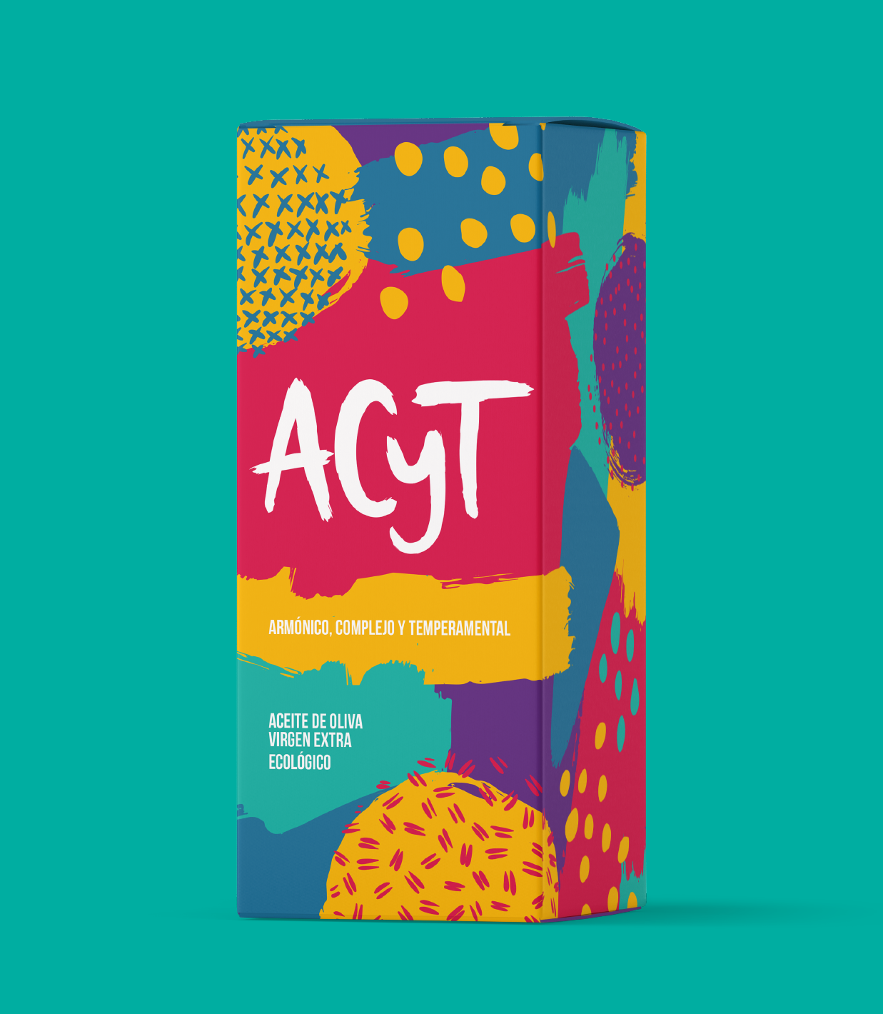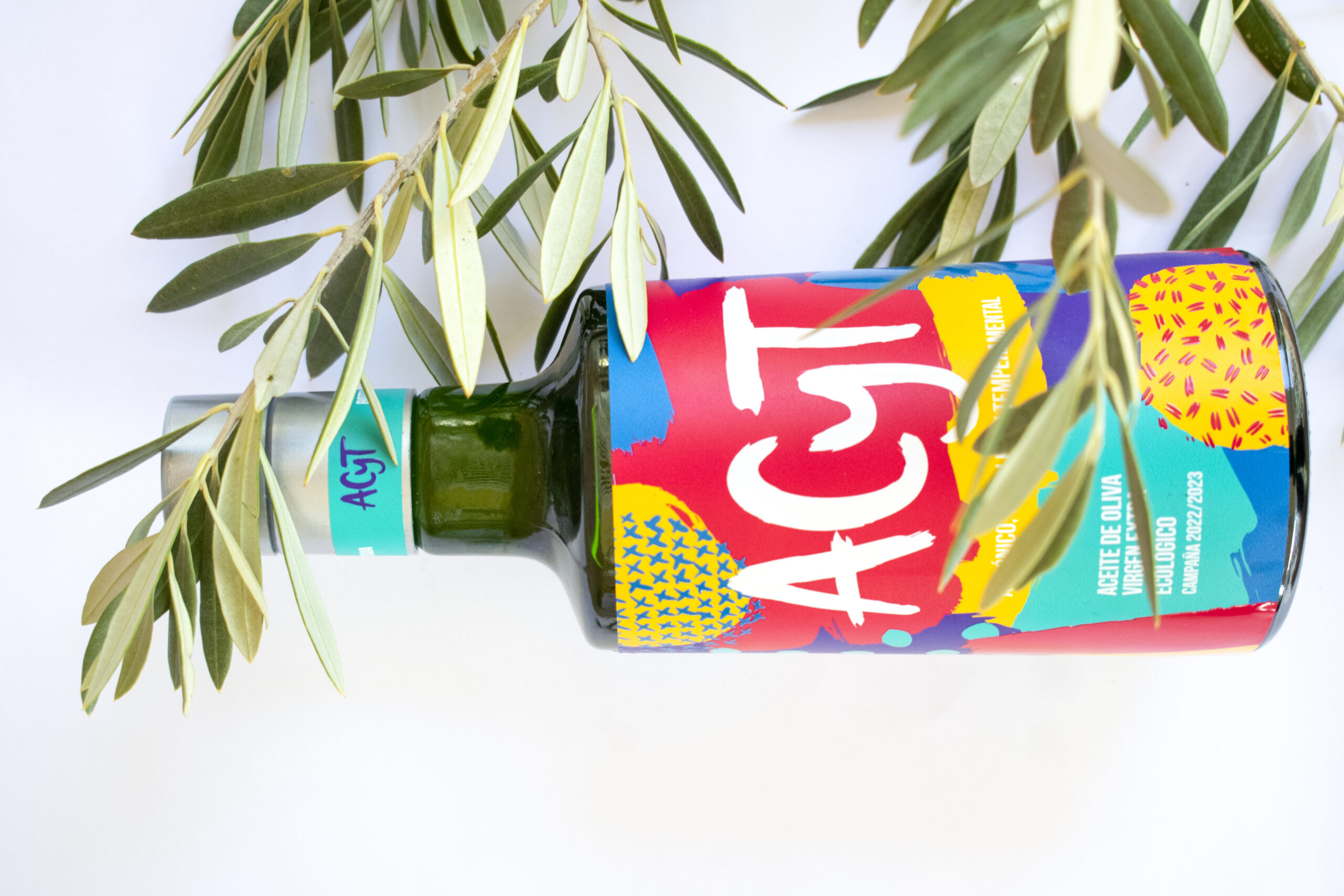
The ACyT team had a clear idea when they embarked on their journey in the olive oil industry. Their aim was to distinguish themselves by being innovative, lively, and creative, all while upholding the highest standards of quality.
I recognized the importance of ensuring that the final products—particularly the logo and the bottle—radiated a sense of playfulness, setting them apart from the more traditional olive oil packaging. A vibrant color palette, organic shapes reminiscent of olive trees and fields, and a custom-made font for the lettermark were the ideal combination to help us attain our objective.
Project scope
Brand Identity Workshop
Custom Logo
Custom Labelling
Visual Identity
Animation
Associated Type & Colours